Final
Dec 12, 2017
Body Horror, The Grotesque, and Maps
One of the first readings we did for this class compared the structure of a map to the anatomy of a body:
Both bodies and web maps have components and systems that interact and intertwine.
The idea of the map as something like a body really fascinated me. I started thinking about how that relation can be extended. Can a map dance? Can a map act?
I’m thinking a lot about the part of the slideshow that compares bodies to maps and I think this is a helpful metaphor that I want to explore with my work in this class, but the more I think about it the less I think I actually agree with it.
If maps are a projection (of 3D space, or even more if you include data being represented as another dimension) on 2D space (a screen in the case of web maps, conceptually any flat surface), then when you think of them in the more traditional sense they are less like bodies in that they can’t react or change to stimuli– the space can, but then you have to change the map. I guess I’m just grappling with the concept of a map as a body in the sense that we use our bodies, as individuals. Thinking about it in those terms is making me want to use that comparison to influence how I choose to represent data and space, and why I make my representational choices. It also invokes a sense of movement and emotion, and temporal recording.
It is worth noting that there is a secondary body comparison in terms of what maps are traditionally meant to represent. The earth and land are often not-quite-anthropomorphized by comparing their natural systems and features to a body.
So with these two different bodies represented within a map, both the actual geography that it might represent and the way the map itself is assembled and functions, there are many different ways we can approach the construction of maps.
Later we learned more about maps as ways to control power-information by governing bodies and the ways parts of maps can be fabricated to notice theft by companies which produce them. I started thinking about distortion and misrepresentation of physical space as a way to display data about misunderstanding or to highlight a lack of knowledge. I wanted to take the map as a body and make it grotesque, or invoke the uncanny. Taking this idea further, the genre of body horror comes to mind:
Body horror, biological horror, organic horror or visceral horror is horror fiction in which the horror is principally derived from the unnatural graphic transformation, degeneration or destruction of the physical body.
Such works may deal with decay, disease, parasitism, mutation or mutilation. Other types of body horror include unnatural movements or the anatomically incorrect placement of limbs to create “monsters” from human body parts.
The point of my final is to hypothesize and test how I can make maps using the design principles of body horror, explore what they might be used for, and what maps made with this intent actually make people feel.
To this end, I originally wanted to use the horrific transformation of borders and land mass to investigate public knowledge of geopolitical spaces. Originally, my concept was to make an application that would allow a user to input data about their knowlege and understanding of the world or a country. This input would be used to control the amount of distortion applied to the output map, either of the world or of just a specific country.
The intent of this would be to highlight how much we rely on maps for our understanding of places we have never been, and examine whether randomly transforming and disfiguring a map that should be commonly seen is noticeable, disturbs people, or is an effective representation of data about misinformation/lack of information.
This idea would have been really difficult to execute for a couple of reasons: firstly, I was planning on distorting the borders of the countries using a noise equation, but am not sure how noise can be implemented considering the way that geoJSON and SVG data works. So for my method, I chose to hand-edit a digital map of a country, moving around and re-shaping interior and exterior borders by using pieces of the original borders to make different ones. I did not fabricate any new borders by drawing, instead patching together pieces of already existing borders using copying, transforming, and the clone stamp.
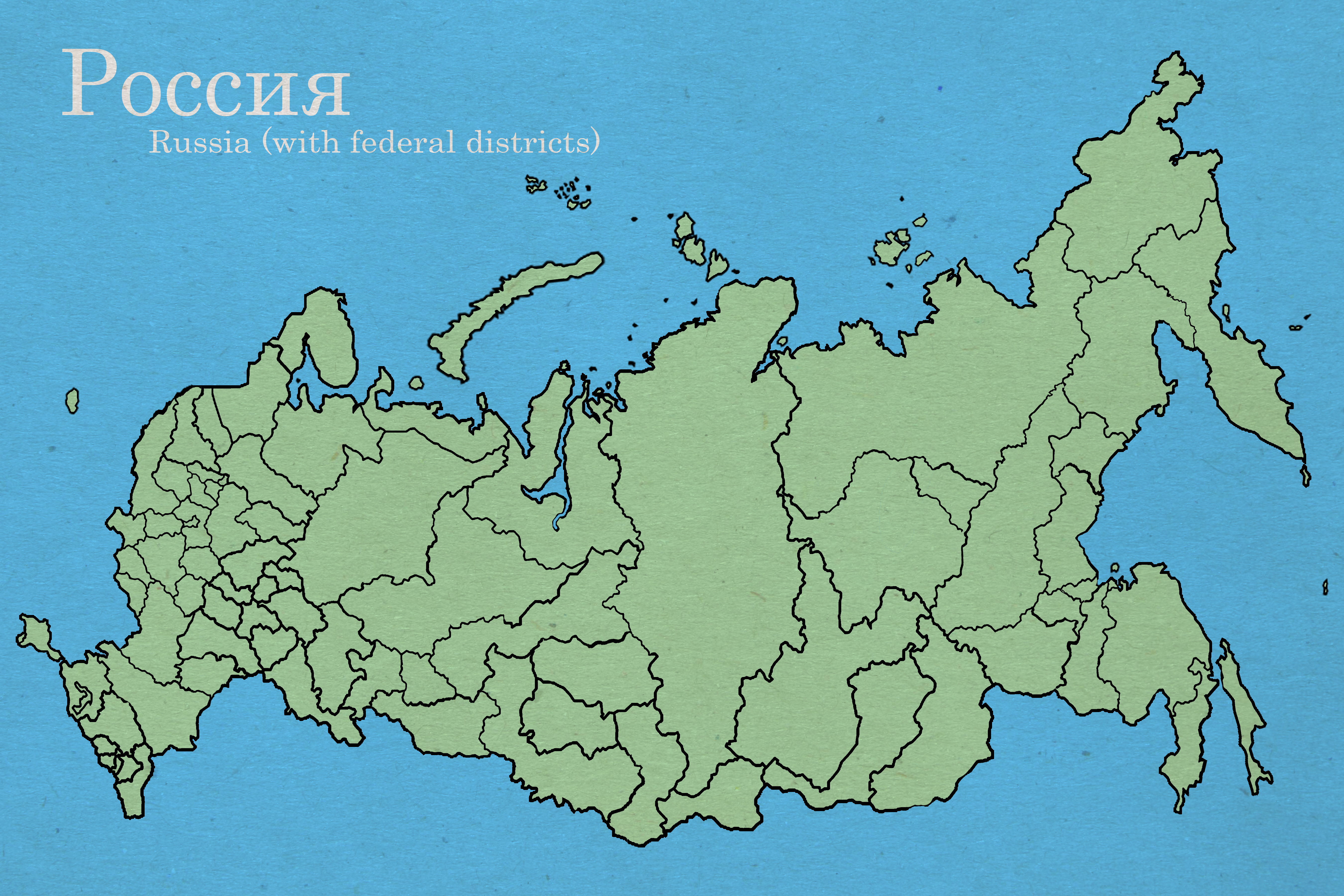
What I ended up deciding to do was to push the boundaries of what would be accepted as a “correct” map of a place people might not be as familar with as a map of the country they are currently in. In the US, we are inundated with images of the body of the country. I personally was not taught world geography in school so I’m really flying blind when it comes to recognizing the shapes of most other countries. Given the issues surrounding Russian influence on current US politics, I thought it would be interesting to make a piece that tried to get away with being an acceptable map of Russia but was in fact very incorrect.
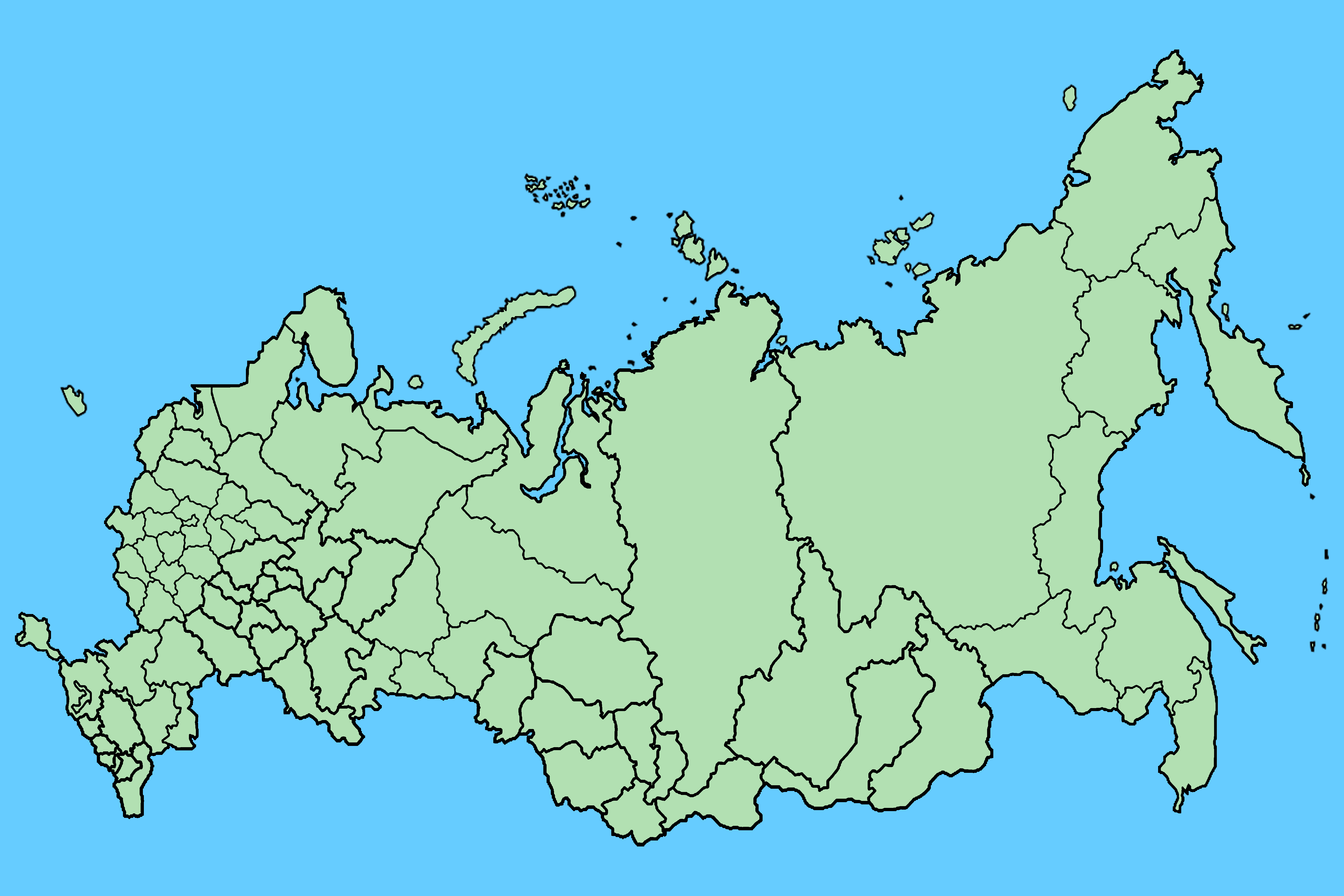
My experience making this map was really interesting as I have no context for what Russia (and its federal districts) look like. I couldn’t tell how much work I was doing or how dramatic the transformation I was making on the map was. I tried to keep from distorting the overall land mass too much, but did try to take and add chunks out of specific coastal regions. Most of the editing I did was to the federal districts– I tried to rearrange as many of those as possible without entirely making new districts. I wanted it to be clearly incorrect to someone who is familar with the map but still have a chance of being plausible to someone unfamiliar with it.
Below, you can see the original map I based my distorted map on, with the new map for comparison.
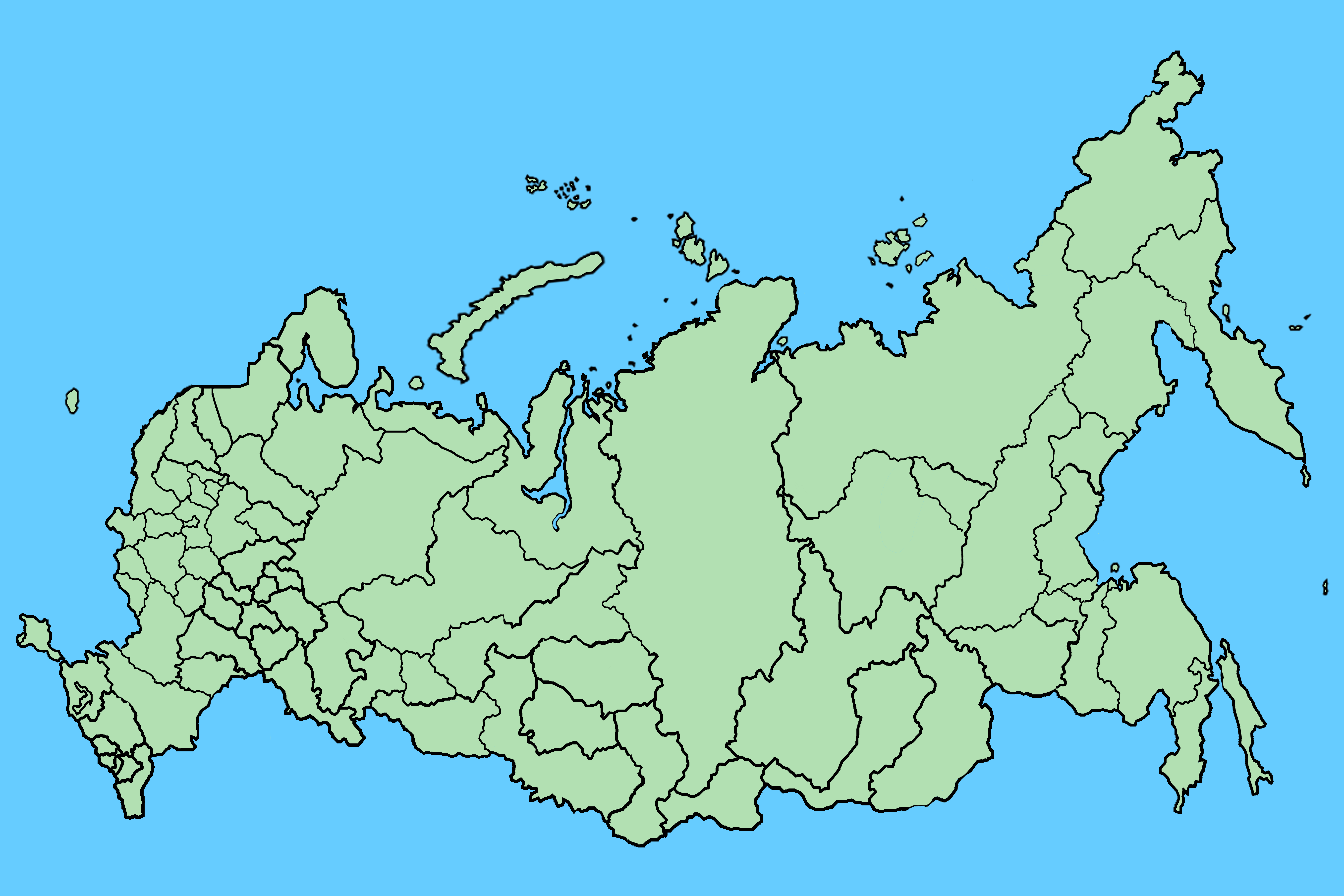
My experience making this “version” of a map of Russia was really interesting because I couldn’t tell how drastic or noticeable the changes I was making were, as I was pretty much unfamiliar with the federal districts and the nuances of the shape of the country overall. So I decided to briefly experiment with applying the same technique to a map of the United States:
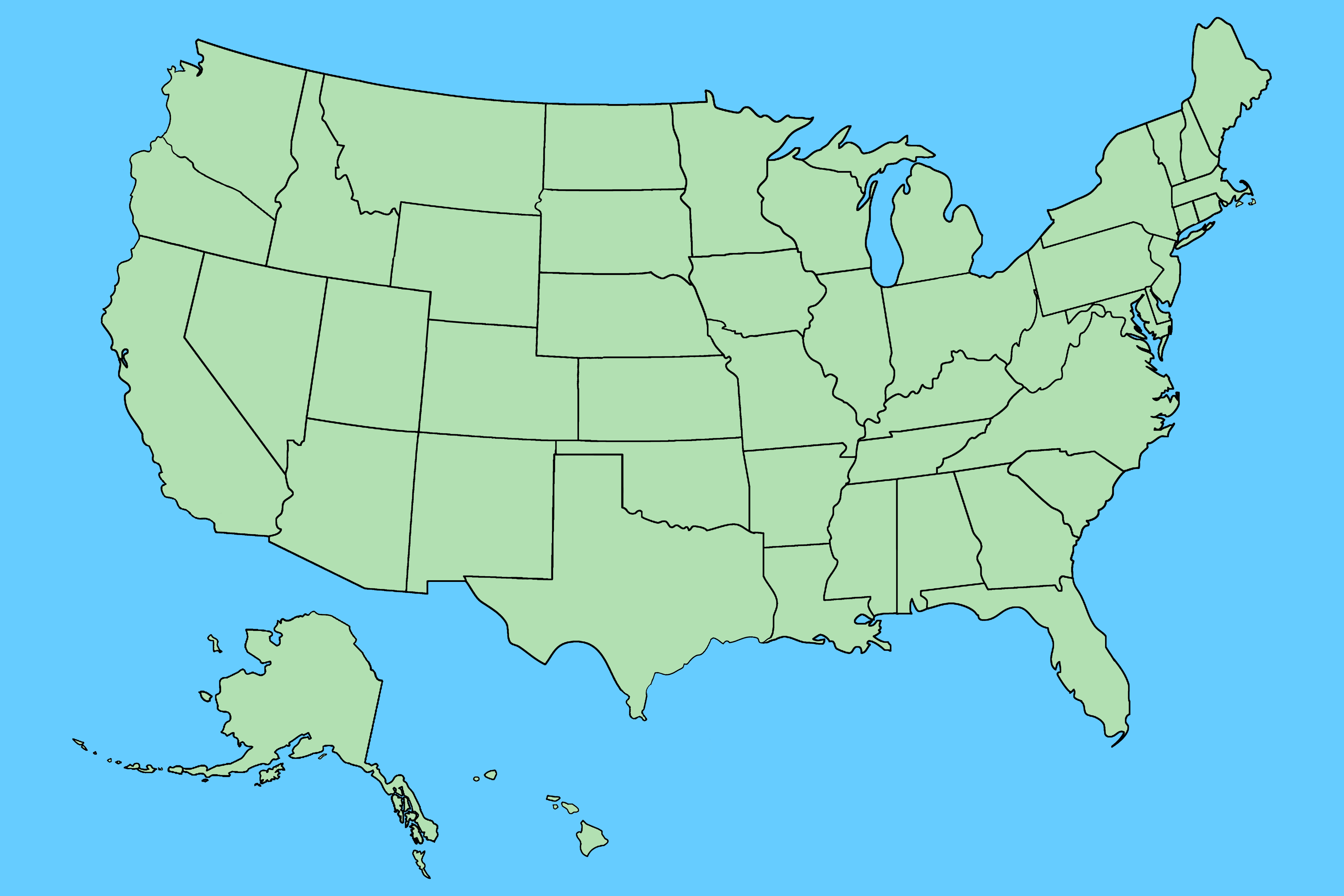
Making both of these maps made me realize my understanding of how I can actually apply body horror to maps is actually pretty limited. I think for an initial process step, re-arranging the known structure of an existing body is going in the right direction. But there are other elements to the “body” of the map that I didn’t consider– roads, labels, color, transparency, texture. My finalized version of the Russia map has a paper texture over it to try to help it decieve the viewer. For the intent I set forward with making it, that’s a sensible choice. However, I think the grotesque and uncanny elements can be emphasized and improved by making other unusual design choices– for example, overlaying a grid or texture that doesn’t make sense, mis-labeling. For projects of a more deliberately abstract or unsettling nature, I think repetition could be used very effectively. I tried to hide the fact I was copying things and moving them around by using small pieces, rotating and reversing lines. However, it would look even more unsettling and unnatural to just allow the repetitive process and transformation to be obvious.
Share